
-210x140.jpg "A-Frames")

How One-Way Vision Film Actually Works
How One-Way Vision Film Actually Works
SIGNAGE | WINDOW FILMS | DISPLAY
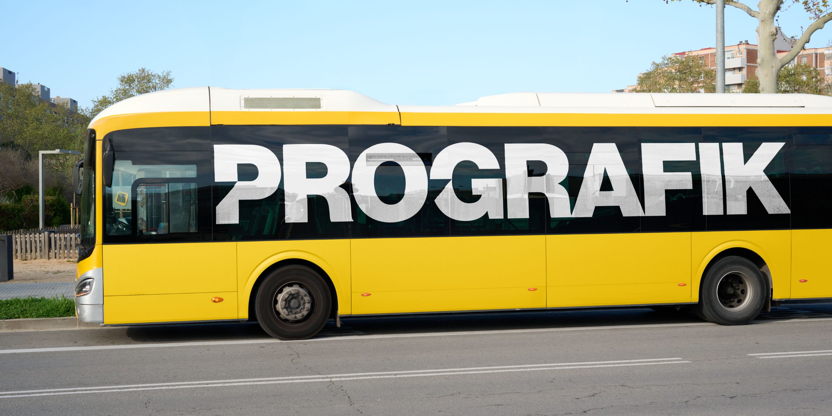
You already know the pitch you give clients: "print on it, stick it on the glass, they see your ad, you see out." Easy sell. But if you've ever had a client ask why it works, it pays to know the mechanics. So let's get into what's really happening on that roll of perforated vinyl, and why the numbers on the spec sheet matter more than most people give them credit for.
Perforation ratio: the number that runs the whole show
Perforation ratio: the number that runs the whole show
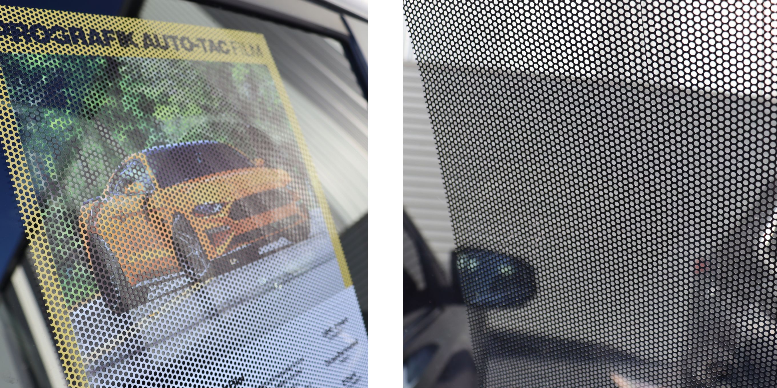
Every one-way vision film is defined by two numbers: hole size and perforation percentage. You'll see this written as something like "2.0mm hole, 60% perforation" or "1.6mm hole, 40% perforation." That percentage is the open area of the film - the proportion of the surface that's actual holes versus solid printable vinyl.
This ratio is the single biggest lever for how the finished job performs, and it cuts both ways:
Higher perforation (55–65%): more open area, better through-visibility for the person inside, but you're printing onto less surface area, so image density and colour saturation take a hit. Fine detail and small text get harder to render cleanly.
Lower perforation (35–45%): more solid vinyl to print on, punchier colour and sharper detail from the street, but reduced visibility from the inside, especially in low light.
This is why you don't just reach for "the good one-way film", you match the ratio to the job. A vehicle application where the driver's line of sight matters (and where VLT compliance is a legal requirement, not a nice-to-have) wants a higher-perforation, more open film. A static retail window that just needs to look sharp from the footpath can run a tighter, lower-perforation film without anyone complaining they can't see out (because, you know, nobody's driving it!).
The optics: it's a contrast trick, not a filter
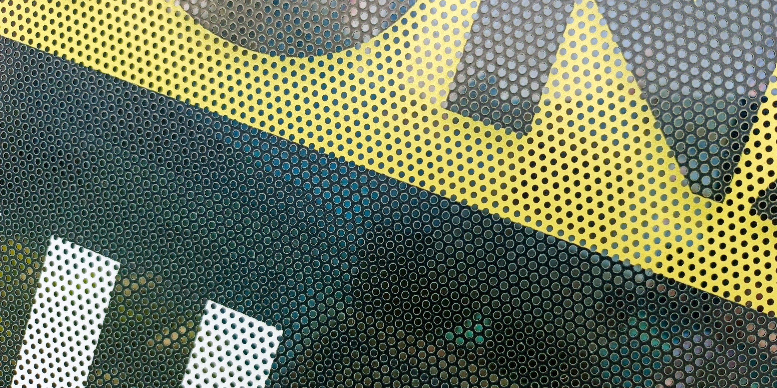
The "how can they not see me" question always comes back to contrast, not some directional property of the vinyl itself. The holes are just holes, and light passes through them equally in both directions. What changes the experience is the difference in light levels either side of the glass.
In daylight, the exterior scene is bright and the printed face is fully illuminated, so from the street the eye reads the solid printed surface (helped along by the black adhesive backing killing any light bleed through the holes) and essentially ignores the perforations. From inside, you're looking through a comparatively dark surface at a much brighter outside world - the perforations register as a fine mesh you look past, similar to how you don't consciously see the mesh of a car's tinted rear window when you're looking at traffic behind you.
Kill that contrast (dark interior lighting, bright interior at night, overcast low-light days) and the illusion weakens or reverses. Worth flagging to clients up front, especially retail fitouts with bright interior lighting rigs: they need to know it's a daytime-facing product, not a permanent one-way mirror.
Printing considerations that actually affect the finished job
Printing considerations that actually affect the finished job
A few things worth being deliberate about at the print stage, since they interact directly with the perforation ratio:
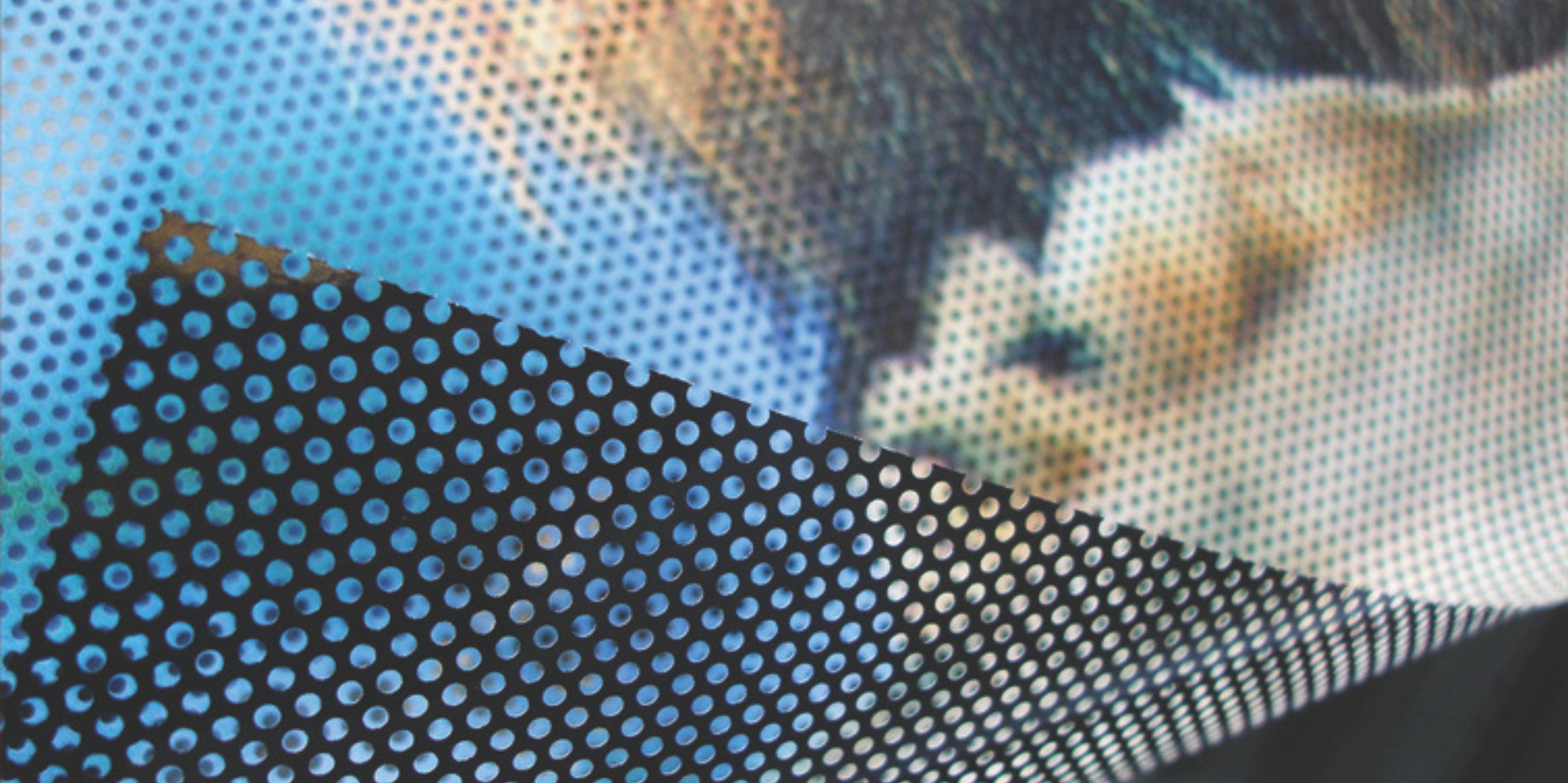
Image density vs. hole coverage: because you're only printing onto the solid percentage of the film, colours will always read slightly lighter and less saturated than the same file on solid vinyl. Boosting density or running an extra pass can help compensate, particularly on the higher-perforation stocks where you've got less surface to work with.
Moiré and fine detail: small text, thin lines, and tight patterns can interact badly with the perforation pattern itself, especially at higher perf percentages. Bolder typography and simplified detail generally translate better than intricate line work.
Ink compatibility and lay-flat: a double PE-coated release liner (worth checking for on any film you're speccing) keeps the material lying flat through the printer, which matters more on perforated stock than solid vinyl since the holes give the material more opportunity to cup or curl during printing.
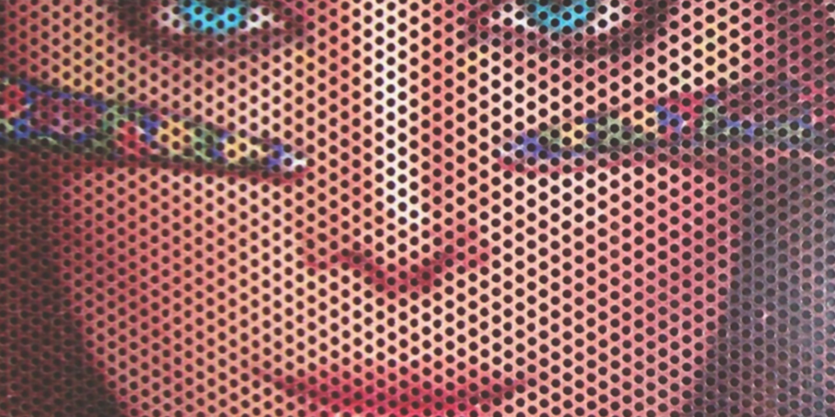
The ratio in practice
If you want a concrete before-and-after of how these numbers play out, it's worth comparing a vehicle-spec film against a retail-spec one side by side.
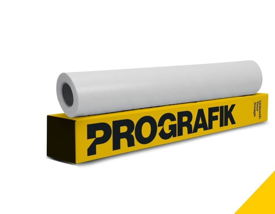
PROGRAFIK's AUTO-TAC is built around a 2.0mm hole at 60% perforation on a 150µ polymeric vinyl — the higher open area and flexible polymeric base are there specifically to meet Visual Light Transmission requirements on Australian roads and to conform to mildly curved automotive glass, with a 2–3 year durability window.
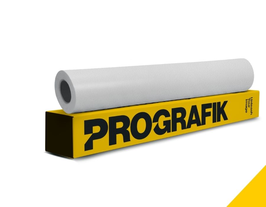
While PROMO-TAC, by contrast, runs a tighter 1.6mm hole at 40% perforation on a 160µ monomeric vinyl — less open area, more printable surface, aimed at flat retail and commercial glass where sharper graphics matter more than a driver's sightline, rated for up to two years.
Same underlying mechanism, two very different perforation ratios, because the two jobs are asking the film to do different things.
One-way vision film isn't a black box, it's a printable perforated surface doing a light-contrast trick, and every practical outcome (visibility, print sharpness, VLT compliance, how it behaves at night) traces straight back to the hole size and perforation percentage you chose for the job. Spec it against the application, not just the price per metre, and most of the "why doesn't this work properly" callbacks disappear before they happen.
One-way vision film isn't a black box, it's a printable perforated surface doing a light-contrast trick, and every practical outcome (visibility, print sharpness, VLT compliance, how it behaves at night) traces straight back to the hole size and perforation percentage you chose for the job. Spec it against the application, not just the price per metre, and most of the "why doesn't this work properly" callbacks disappear before they happen.